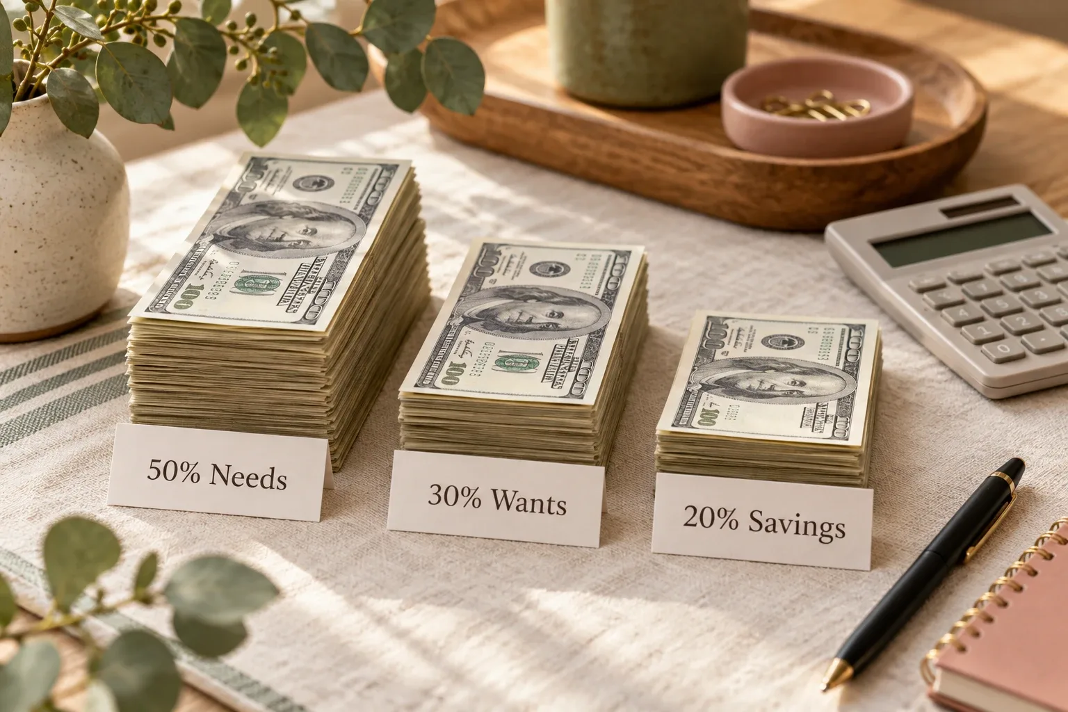
Make the next amount, date and decision easy to see. Keep decoration around the numbers, not in their way.
A budget planner aesthetic should make your money easier to read, not harder to find. A soft palette can be pleasant to use. But if you have to zoom in to see a bill, remember what a pink square means, or open five decorative pages to find one balance, the design is working against you.
This guide is about visual clarity, not choosing a new budgeting method. Keep your existing numbers and improve how you see them. For the essential sections, start with the monthly budget planner guide; for optional decision pages, see budget planner ideas.
Start with the question your first view must answer
Before choosing colors, write down the decision you want to make: “What bill comes next?” or “How much of this category is left?” Put the information for that answer where you first look. A large motivational quote should not push a payment deadline below the fold.
Consumer.gov describes a budget as a spending plan that you compare with actual spending. That is the foundation. Your cover, headings and decorative elements can change; the plan and the records still need to be visible.
Five design choices worth checking
| Design choice | What can go wrong | A more useful option |
|---|---|---|
| Soft colors | Pale figures disappear into a pale background. | Use dark text; keep light colors for accents. |
| Color coding | You forget whether rose means paid or overdue. | Add a written status and a date. |
| Decorative headings | A large quote crowds out the next bill. | Give the important amount and deadline more space. |
| Many small panels | You keep scrolling to compare related amounts. | Place the figures for one decision together. |
| Several matching views | The same expense is entered more than once. | Keep one source record and clearly dated summaries. |
These are editorial design checks, not five features promised inside a recommended template. Change the part that creates friction; you do not need to rebuild the whole planner.
Keep the numbers stronger than the background
A sage header or rose highlight can make a page feel calm. Small rose writing on cream may be difficult to read. Try dark lettering on a light background for amounts, category names and dates, then reserve softer shades for section backgrounds or a small accent.
For digital text, W3C's WCAG contrast guidance provides a useful reference: at least 4.5:1 for ordinary text and 3:1 for qualifying large text. Its separate use-of-color guidance says color should not be the only way to communicate information. These are accessibility references, not a certification of your planner or a claim about Pinterest performance.
For a paper planner, also check the actual print: paper, ink and lighting affect the result. For a digital planner, open the working view on the phone you normally use, at your normal zoom. If an important total needs pinching and hunting every time, simplify the view or enlarge the text.
A small example: pretty, but still useful
The table below is an original illustrative spending view you could draw or build yourself. It is not a screenshot of a Creative Fabrica product and is not offered here as a downloadable PDF or Notion template.
| Category | Plan | Spent | Left |
|---|---|---|---|
| Groceries | $450 | $280 | $170 |
| Transport | $180 | $95 | $85 |
| Personal | $120 | $80 | $40 |
| Total | $750 | $455 | $295 |
Here, “Left” means the category plan minus recorded spending. The $295 is not your bank balance, emergency savings, or permission to spend everything. Other bills, pending transactions and obligations may still need money.
You could give the header a sage background and the total a rose accent while keeping every amount dark and clearly labeled. The useful part is the comparison: personal spending has $40 left, so the next purchase needs to fit that category or be covered by an intentional change elsewhere.
Add a real “updated through” date when you use your own version. If transactions are missing, the remaining figure is incomplete, even when the layout looks finished.
Give every color a written meaning
Use labels such as “due,” “paid,” and “review,” rather than relying on green, rose and gray alone. A bill row needs a due date and a payment status. A payment marked “scheduled” is not automatically the same as a payment confirmed as paid.
A savings progress bar should have a current amount and target beside it. A row that needs attention can have both a colored mark and a short note explaining what to check. If you print in black and white, the meaning should survive.
Use the same meaning consistently within your own planner. There is no universal rule that one brand color must represent one financial category.
Remove one layer before adding another
- Move a decorative cover below the working summary if it delays the first useful number.
- Hide fields that do not change the decision you make in this view.
- Keep the category label next to its amount; do not make color stand in for a name.
- Give long notes a separate place so they do not shrink the figures.
- Keep one source for each transaction. If your Notion setup supports database views, check that the views reference the same records rather than assuming they do.
Test one change during your next 15-minute weekly money check-in. Can you find the next obligation, compare plan with spending, and identify one adjustment? Keep the change if it helps. Do not treat an elaborate redesign as evidence that the budget is current.
Ready-made options: check the working view, not just the cover
A ready-made template can save setup time, but a polished sales image cannot prove that its amounts are readable on your phone. Check the listing, actual working screens, duplication instructions, format and fields before choosing.
Two existing options below serve different needs. PLR Finance Tracker is a Notion template whose listing describes income and expense tracking, editable categories and savings tracking. Premium Personal Finance Planners is a Google Sheets and Excel bundle, not a Notion product. Choose by the format you will maintain, not by color alone.
We have not purchased or duplicated these products. The table and design suggestions in this article are our own examples; do not assume they are included pages or formulas. Official previews are shown unchanged in the recommendation block.
Template options to compare
Choose the format and scope that match your routine; you do not need all of these products. Check the current listing, included files and setup requirements before buying.
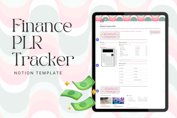 Notion template
PLR Finance Tracker
A focused Notion tracker for income, expenses, editable categories and savings goals. Choose it when you want to maintain money records without a whole-life workspace.
View the product and included files →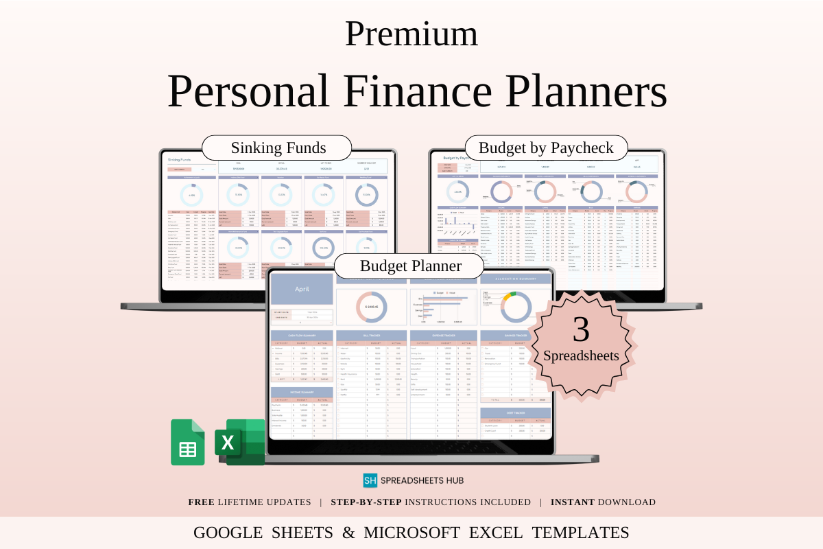 Google Sheets / Excel
Premium Personal Finance Planners
A spreadsheet bundle with paycheck, monthly budget, and sinking-fund layouts supplied in sample and blank versions for Google Sheets and Excel.
View the product and included files →Questions people ask
Can a budget planner be aesthetic and practical?
Yes. Keep the important amounts, dates and labels readable, then add a limited palette and decorative details around them. Appearance should support the decisions you make.
How many colors should I use?
There is no required number. A light background, dark text and one or two accents can be an easy starting point. Use written labels whenever a color has meaning.
Is the example table a free printable or a Notion download?
No. It is a small educational example displayed in this article. You can recreate the idea in your own planner; it is not a supplied product file.
Do I need to buy a new template to improve readability?
No. Start with text size, contrast, labels and the placement of your existing information. A simpler view may solve the problem without buying another planner.
Sources and product information
The layout suggestions and worked table are Calm Budgets editorial examples. Budgeting basics and accessibility references are linked below; product descriptions come from their public listings.
- Consumer.gov: Making a Budget
- W3C: Understanding minimum text contrast
- W3C: Understanding use of color
- Creative Fabrica: PLR Finance Tracker Notion Template
- Creative Fabrica: Premium Personal Finance Planners
Written by Calm Budgets